In 2026, a mobile-friendly website is not just an advantage—it is a necessity. With most users browsing the internet through smartphones, businesses must ensure their websites are optimized for mobile devices. A poor mobile experience can result in lost traffic, lower rankings, and reduced conversions.
Contents
What is a Mobile-Friendly Website?
A mobile-friendly website is designed to work smoothly across all screen sizes, especially smartphones and tablets. It adjusts layout, images, text, and navigation automatically so users can easily browse without zooming or scrolling excessively.
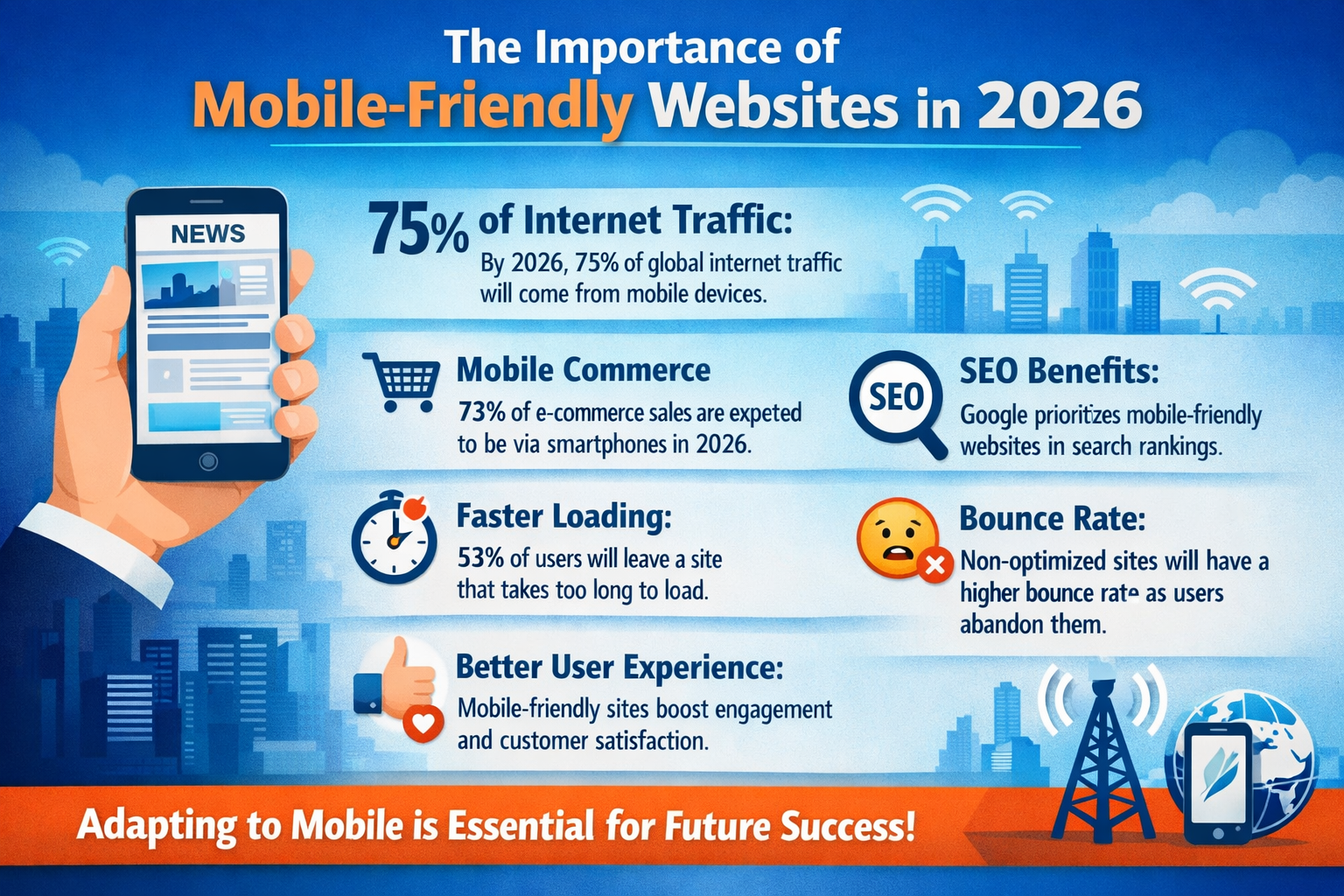
Why Mobile-Friendly Websites Matter in 2026
1. Majority of Users Are on Mobile
Most internet traffic now comes from mobile devices. Users prefer browsing, shopping, and searching on their phones because it is faster and more convenient. If your website is not optimized for mobile, you are losing a large portion of potential customers.
2. Better User Experience (UX)
User experience plays a critical role in keeping visitors on your site. A mobile-friendly website ensures:
- Fast loading speed
- Easy navigation
- Clear readability
When users have a smooth experience, they stay longer and are more likely to take action.
3. Higher Search Engine Rankings
Search engines like Google use mobile-first indexing. This means the mobile version of your website is the primary factor in determining your ranking.
If your website is not mobile-friendly:
- Your rankings will drop
- Organic traffic will decrease
- Competitors will outrank you
4. Improved Conversion Rates
A well-optimized mobile site makes it easy for users to:
- Fill out forms
- Make purchases
- Contact your business
Simple layouts, clear buttons, and fast performance directly increase conversions and sales.
5. Faster Website Speed
Mobile users expect websites to load within seconds. A mobile-friendly site is optimized for speed, reducing loading time and improving overall performance.
Slow websites lead to:
- High bounce rates
- Lower engagement
- Lost revenue
6. Stronger Brand Credibility
A clean, responsive, and professional website builds trust. Users are more likely to trust and engage with businesses that offer a smooth mobile experience.
On the other hand, a poorly designed mobile site creates a negative impression and reduces credibility.
7. Boost in Local SEO
Mobile searches often include location-based queries like “near me.” A mobile-friendly website increases your chances of appearing in local search results, helping you attract nearby customers.
Key Features of a Mobile-Friendly Website
To succeed in 2026, your website should include:
- Responsive design
- Fast loading speed
- Mobile-optimized images
- Easy navigation menu
- Clickable buttons and CTAs
- Secure HTTPS connection
- Minimal pop-ups
How to Make Your Website Mobile-Friendly
Follow these steps:
- Use responsive web design
- Optimize images and reduce file size
- Improve website loading speed
- Use simple and clean layouts
- Test your website on multiple devices
- Avoid heavy scripts and unnecessary elements
Conclusion
In 2026, mobile-friendly websites are essential for online success. They improve user experience, increase search rankings, and boost conversions. Businesses that invest in mobile optimization will stay ahead of the competition and achieve long-term growth.